This tutorial uses a spreadsheet of Minneapolis police reports.
Pivot Tables, which are available in Microsoft Excel and Google Sheets, are the most powerful tool (in my opinion) you have in a spreadsheet program. It allows you to take very detailed data -- in this case, where one row represents a reported crime -- and generate the summary findings that you need for your story. This usually answers your "who, what, when, where" questions (data is really bad at answering "why", so I'm leaving that out.) and gives you the over-arching findings you're likely looking for.
For example, let's look at our sample data on reported crimes in Minneapolis. Some common questions we might have, include: Which neighborhood had the most reported crimes? What type of crime was most often reported? Which month had the most crimes?
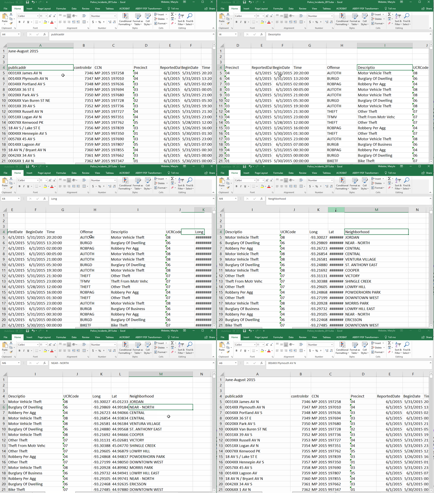
Because each row of our data is a single crime, we can't just sort our spreadsheet to get the answers to our questions. All of those questions require "grouping" rows together based on specific values stored in the database. This kind of summarizing is one of the most common things you'll do in analyzing data. For example, to answer our first question about how many crimes in each neighborhood, we need our answer to show each neighborhood (listed just once) and the number of crimes reported there.
I find it helps to envision your answer before trying to create it. I'd want it to look something like this:
To get an answer like that, we'll use the Pivot Tables tool. This first video shows a very basic Pivot Table.
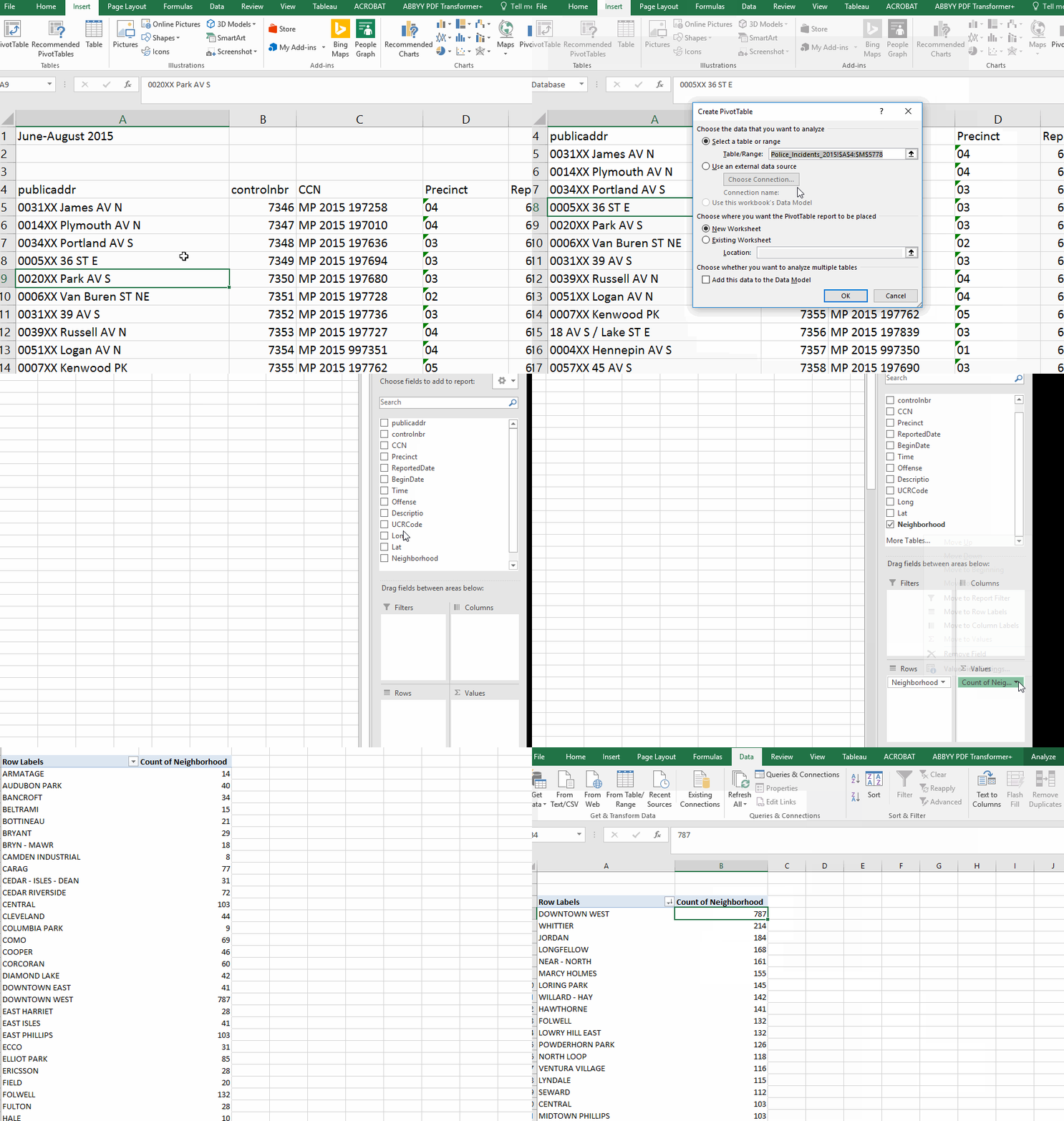
Here are the steps shown in the video:
- Make sure your cursor is located somewhere inside your data (not out in the blank spaces). Also make sure all your columns are properly named. Without a name, the field won't be visible to the Pivot Table design tool.
- Go to the Insert menu and click on the Pivot Table button (on the far left)
- It will ask about the source of your data (it should guess correctly) and where you want to put the Pivot Table (default is a new worksheet). Just make sure these things are correct.
- The Pivot Table designer appears on a new sheet. On the right, you'll have a list of your fields and below that four boxes where we'll do the designing.
- The "rows" box is where you identify which column has the values you want to use as each row. In this case, I want one row for each neighborhood.
- The "values" box is where you do the counting or summing (or other math). In this case we are simply counting rows (each row is a police report) so it doesn't really matter what column you put in here.
- You can choose to count, sum, average or get minimum or maximum values (and other things) by clicking on the item you just put in the values box and choosing "Value Field Settings."
- You can sort your results by putting your cursor on the first value of the column you want to sort and going to the Data menu and choose either A to Z or Z to A.
Helpful hint: As you're working in your Pivot Table, it's possible the field list and the four boxes on the right might disappear. Don't worry, you didn't do anything wrong! To get them back, simply click anywhere inside the Pivot Table results.
Filtering your data
You can filter the data being used for the Pivot Table with the "filters" box on the designer. For example, let's say we want to find out how many burglaries were reported in each neighborhood. If you look at the original data, you'll see that the field called "Offense" has a code for burglary of a dwelling -- "BURGD". So we'll put the "offense" column in the filters box. Then a pull-down menu will appear at the top of your results, giving you the option to pick which offense(s) you want to include in your answer.
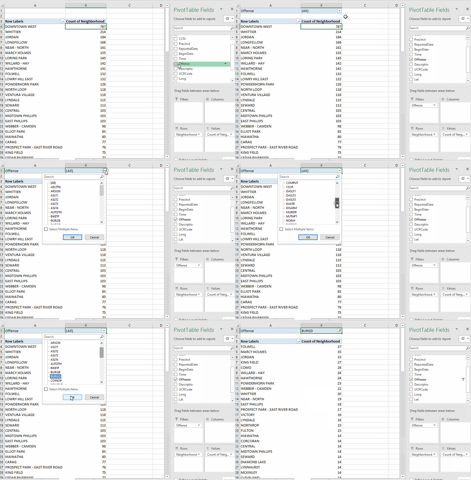
Note that you can filter on multiple fields. Just put any field(s) you want in the "filters" box and it will create multiple pull-down menus above your data.
Making a cross-tab
A cross-tabulation is when you have two variables you want to measure against each other. One will be in the rows and the other in the columns. For example, we might want to know how many reports of each type of crime occurred each month (our data covers a 3-month period).
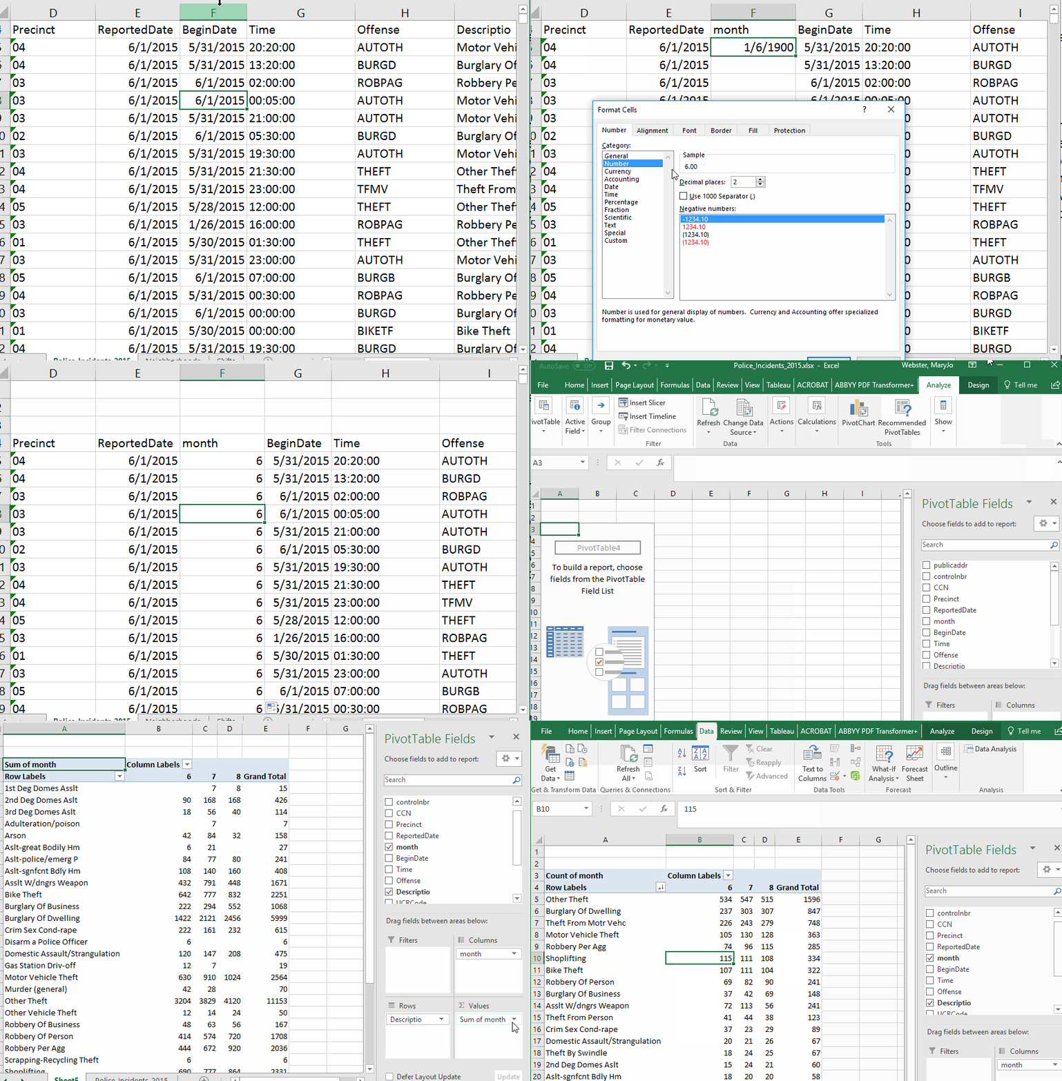
First, we need to make a little detour. Our data has a field indicating the date the crime was reported. But we need a column that only has the month. So we can add a new column to our data and use the MONTH() function to strip the month out of the date. (see the video)
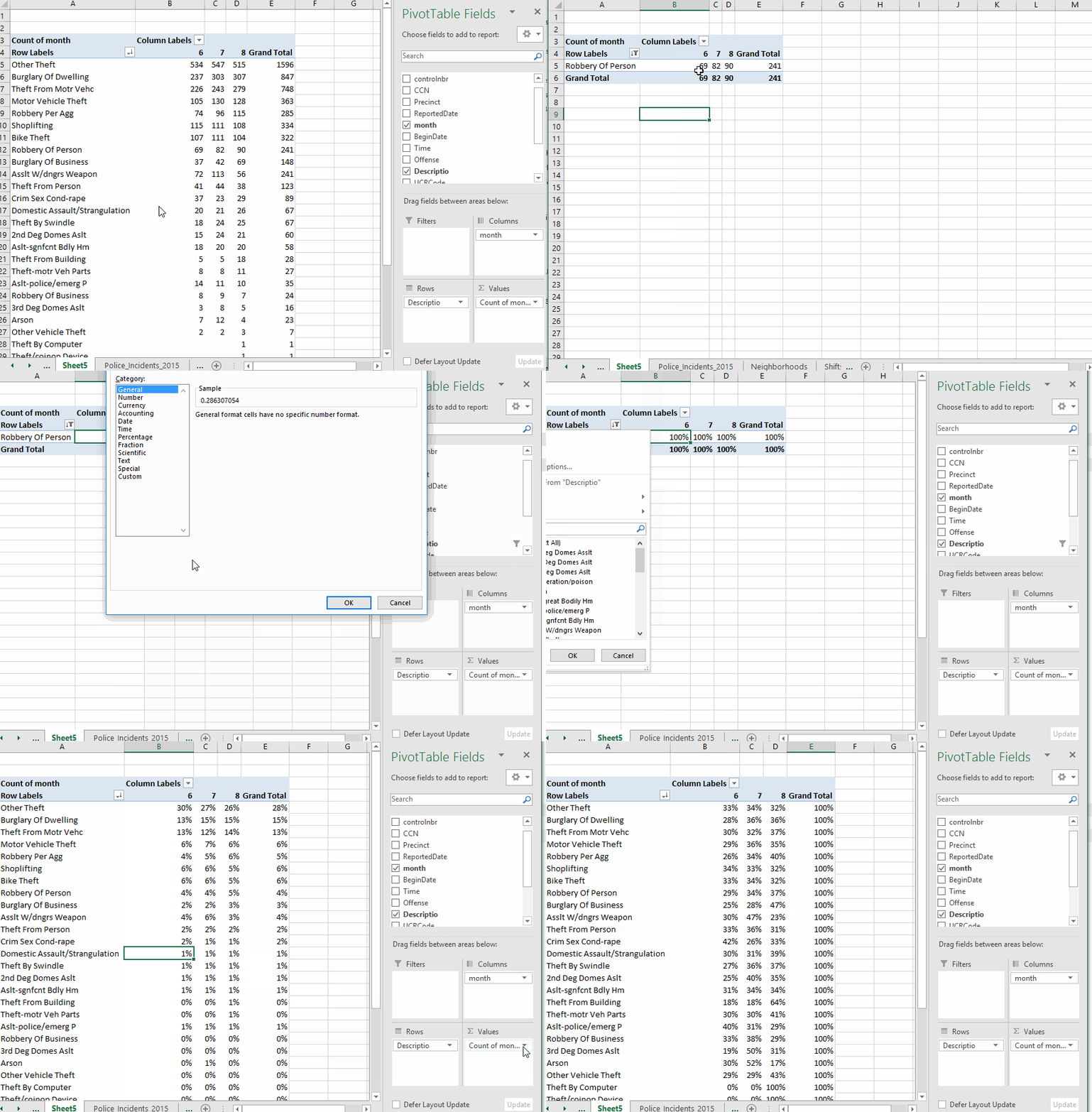
Then we'll launch a new Pivot Table. This time the offense description will be in the rows; our new month field will go in the "columns" box ; and we'll put a count in the values box (like we did last time)
Note: After creating the new column, it might not show up in the list of fields for the Pivot Table. If not, go to the Analyze menu at top of screen and choose "Refresh." (I've shown this in the video, too). If you add a new column on the far right, you might need to choose "Change data source" and make sure it's grabbing the new column, as well.
Displaying percentages
So far, we've just been counting the records and displaying raw numbers. But it is possible to display percentages. In the example we just did, we can tell Excel to display the "row percentage". In other words, it will show us what percentage of robberies, for example, occurred in each month. Or we could do a "column percentage" -- which in this case would give us, for example, the percentage of all the crimes in June that were robberies. In the video, I'm also going to filter the rows to just a couple categories so it's easier for you to see what it's doing on the row percentage. I'll have to turn that off to get accurate column percentages, though.
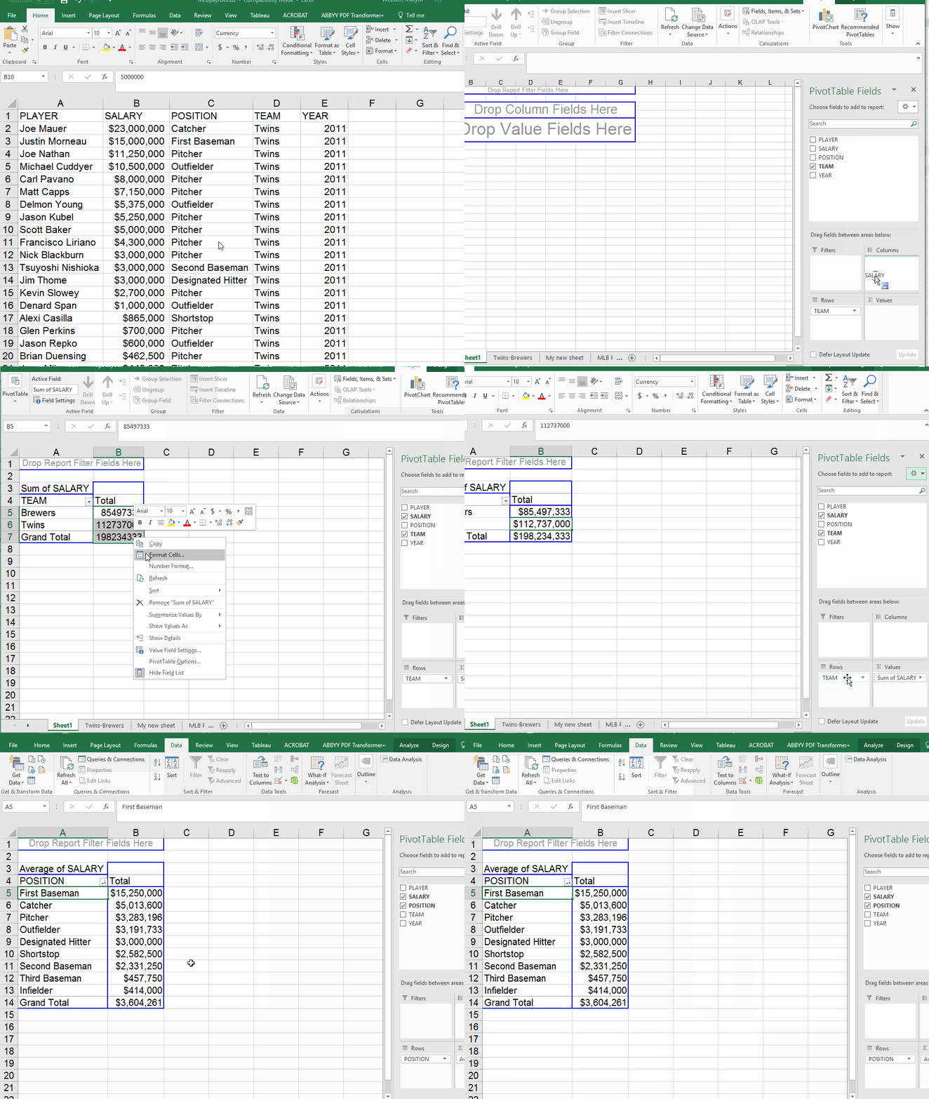
Let's switch to another dataset to show you some other features. For this part, we'll use a spreadsheet of baseball salaries and payrolls that we also used in the beginner excel tutorial. We'll use the worksheet called "Twins-Brewers" that has the player salaries for the Twins and the Brewers from 2011.
We'll start by running a couple simple Pivot Tables -- the total each team paid out, and the average paid out by position. (Note: the fact that we only have 2 teams in here makes this kind of useless. But imagine doing this with all the players, from all the teams.
Adding a second value
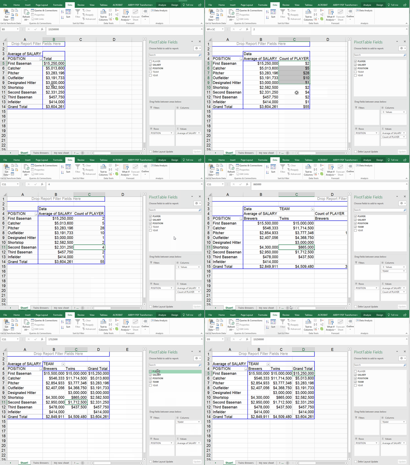
We might want to know how many players this is counting up. Remember that each row of our data represents one player. So we can add a second math column (in the "values" box) and tell it to count. It doesn't matter which field you pick. To make it simple, I'll just pick "player." Note that the order the items appear in the values box dictates which one comes first in your answer. You can drag and drop an item to flip spots.
The cross-tab feature can also come in handy here, if we put "Team" in the columns box we can see average salary each team pays, by position. However, since we still had the number of players in there, we end up with this crazy mess. So I took out the number of players. Now we have the average pay by position for each team (note that the overall average is in the "grand total" column now.
Adding multiple items in rows
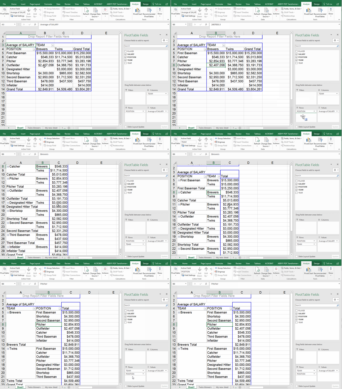
What happens if you put two items in the "rows" box? I often find that this doesn't help me much. In this example, we'll move the team value out of the columns box and add it to rows. Note that it automatically falls in the second position -- so the answer it gives displays the position first, then the teams. If you flip them around in the rows box, you get a different view.
Running formulas
There may be times when you want to run some calculations on the results of your Pivot Table. I find that formulas get a little hinky when you try to set them up against the Pivot Table results. So I tend to copy and paste the results (except the headers!) to a new worksheet. Then add the headers and do the math there. Beware: If you copy the headers, it will just copy the whole Pivot Table -- code and all.